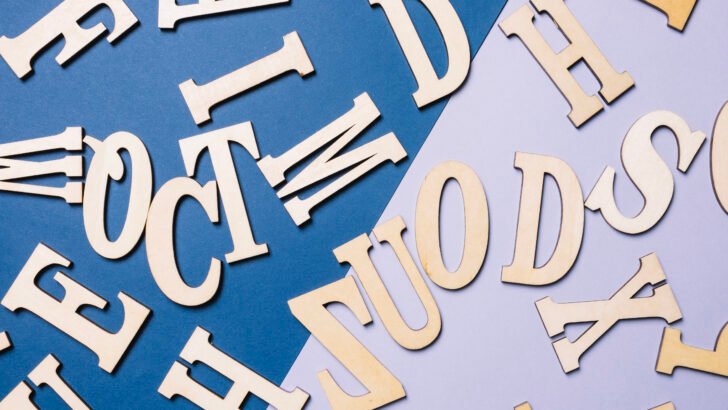
The Basics of Typography for Beginners
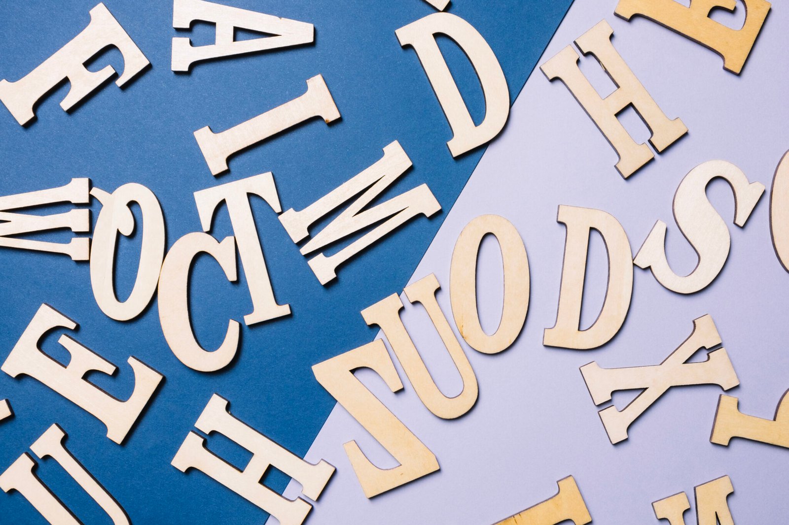
Ever wondered why some text looks so good and is easy to read, while others just feel “off”? The secret is typography. Typography isn’t just about choosing a font; it’s about the art and technique of arranging type to make written language legible, readable, and appealing when displayed.
For beginners, here are the key elements to pay attention to:
Font vs. Typeface: A typeface is the entire family (e.g., Helvetica), while a font is a specific weight or style within that family (e.g., Helvetica Bold).
Kerning: This is the space between two specific characters. Adjusting it can improve the visual flow of your text.
Leading (line-height): This is the vertical space between lines of text. Too little leading makes text feel cramped; too much makes it look disconnected.
Hierarchy: Use different sizes, weights, and styles to guide the reader’s eye and emphasize important information, like headings and subheadings.
By paying attention to these basics, you can start creating designs that are not only beautiful but also effective.